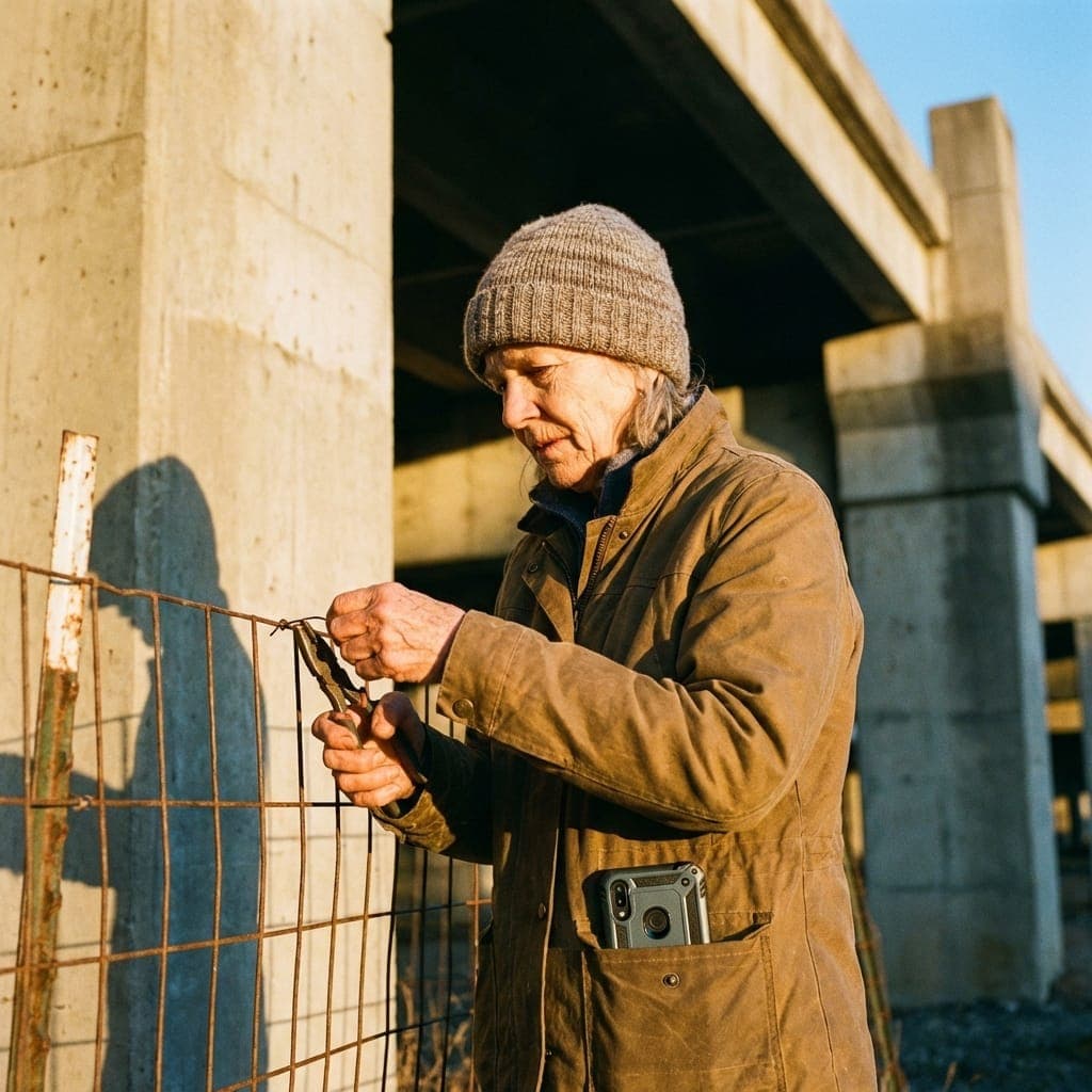
The 3 AM Beach Test 🌊
Imagine this: It’s 3:15 AM. You are on a remote stretch of coastline. The wind is gusting at 20 knots, carrying a fine mist of salt spray and sand. You are holding a heavy flashlight in one hand and a data-logger in the other.
Your job is to coordinate a team of four volunteers who are currently spread across two miles of beach, monitoring nesting sea turtles.
Now, pull out your phone.
Is the app you’re using designed for this? Probably not.
Most SaaS is built for a 72-degree office with 5G connectivity, a Retina display, and a perfectly clean index finger. But Dirt SaaS—software that actually lives in the field—has a different set of rules.
Why "Office Tech" Fails in the Field
When "Office Tech" goes to the beach, it becomes a liability.
- The QR Code Struggle: Have you ever tried to scan a QR code in the dark with a shaky hand while the wind is flapping your volunteer's lanyard? It takes 30 seconds. In the field, 30 seconds of frustration is an eternity.
- The "Glass Box" Problem: Modern apps love subtle grays and thin fonts. But under a glaring sun (or a dim flashlight), those "elegant" designs disappear. If you can't read the button without squinting, the tech is in the way.
- Connectivity Anxiety: "Loading..." is a death sentence for field data. If your app needs to "ping the server" just to open a check-in screen, it shouldn't be in the dunes.
The Logic of Field-Tested Reliability
We believe that a tool should feel like a hammer: reliable, tactile, and obvious. Here is how we ensureProximatic survives the 3 AM Beach Test.
1. High-Vis Interaction Design
We use thick black borders, vibrant primary colors, and heavy fonts. This isn't just a "vibe"—it's a visibility strategy. When your screen is covered in fingerprints and the sun is at high noon, you can still see exactly where the "CHECK-OUT" button is.
2. The "Wet-Finger" Standard
In the field, you don't have precision. Your hands might be wet, sandy, or gloved. We design every interaction to be a "Big Tap." No tiny "X" buttons to close a modal. No microscopic dropdown menus.
3. "Check-in" Without the Phone
The ultimate field UI is no UI.
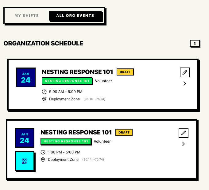
We use Geofencing and NFC "Handshakes" to make coordination invisible.
- The Geofence: The coordinator defines the beach. When the volunteer enters the zone, the system pulses. "John is on-site."
- The NFC Tap: No cameras. No focus issues. Just tap the phone to a coordinator's badge. Bip. Done.
Field Tech vs. Office Tech: A Comparison
| Feature | Standard SaaS | Proximatic (Field-First) |
|---|---|---|
| Typography | 12px Light Gray | 16px Black Bold |
| Buttons | Subtle Gradients | Solid Blocks w/ Borders |
| Auth | Magic Link (Email) | Persistence + Offline Token |
| Check-in | Manual Entry | Geofence / NFC Tap |
| Connectivity | Re-sync on every tap | Local-First / Background Sync |
"At 3 AM, the turtle matters more than the tech."
Our goal is to make the software so invisible and reliable that you forget it’s there, allowing you to focus on the salt air, the wind, and the mission at hand.